
What are strong slides structures to share your synthesis work?
In short: there are many ways to do it. Here 6: step by step, overview of all insights, so what call out, statement, proof points, metaphor.

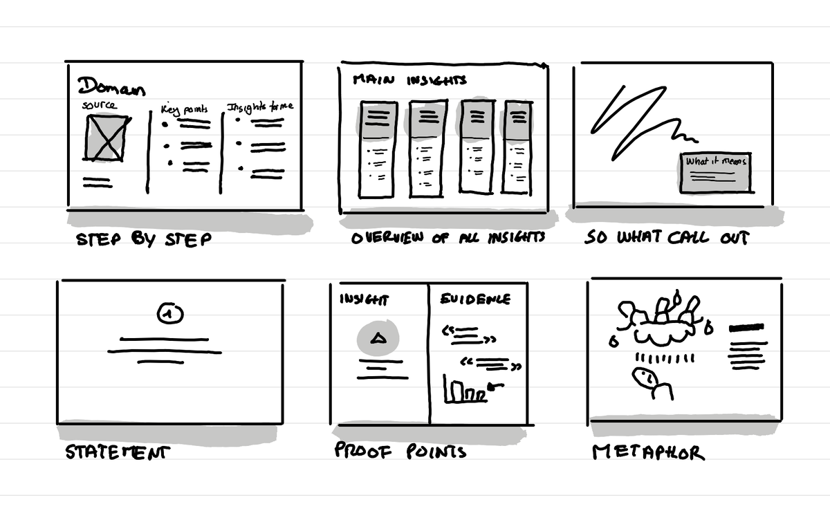
Step by step
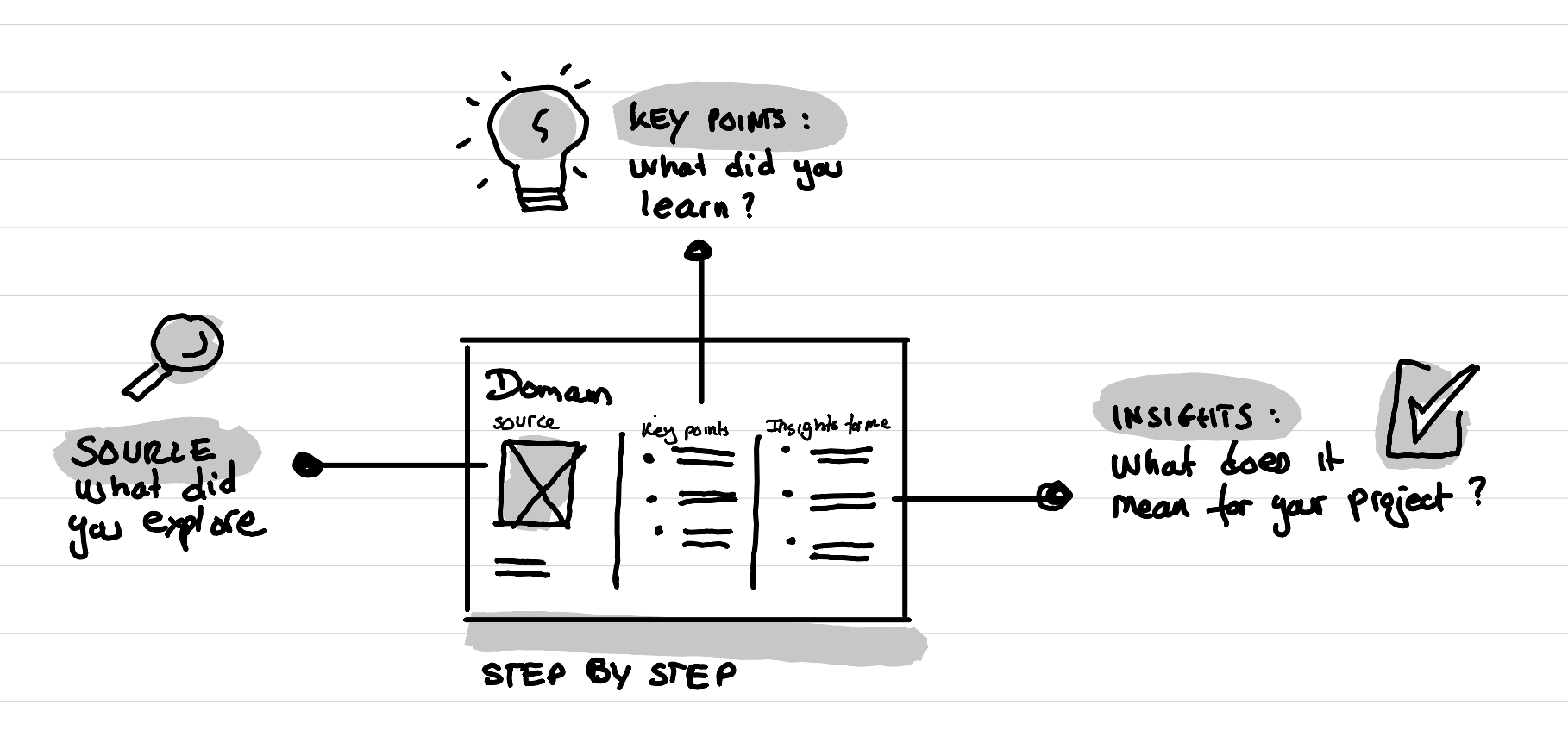
This is a very structured slide where you first show what you explored. For example you might say I read books about this topic, or I talked with experts about this. Then you show what are the key points that came out of these sources. And finally you reveal what this all means for your project.
Overview of all insights
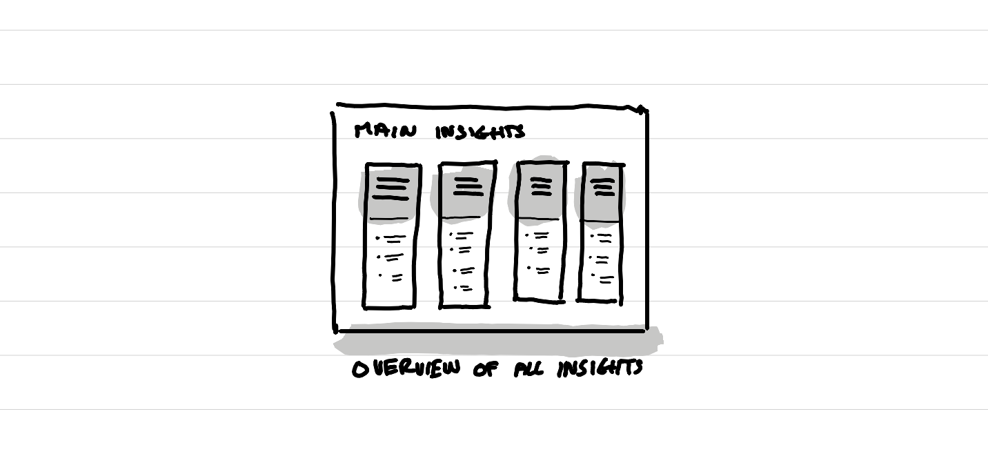
This is a summary slide, that can come near the end of a presentation. It sums up all the most important things you learned for your project based on the research. By categorizing it all in 3 to 5 categories you help people keep the overview.
So what call out
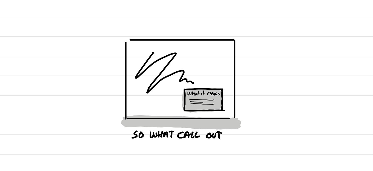
This is an add-on that comes again and again through out a presentation. A call out that answers the question "So what?". On a slide where you showed what you've learned, what you did, or what you explored, you add a box on top that reveals what this means for your project. This is especially strong if you do it several times throughout your presentation as it creates a nice break in the story line that people then expect to see again and again.
Statement
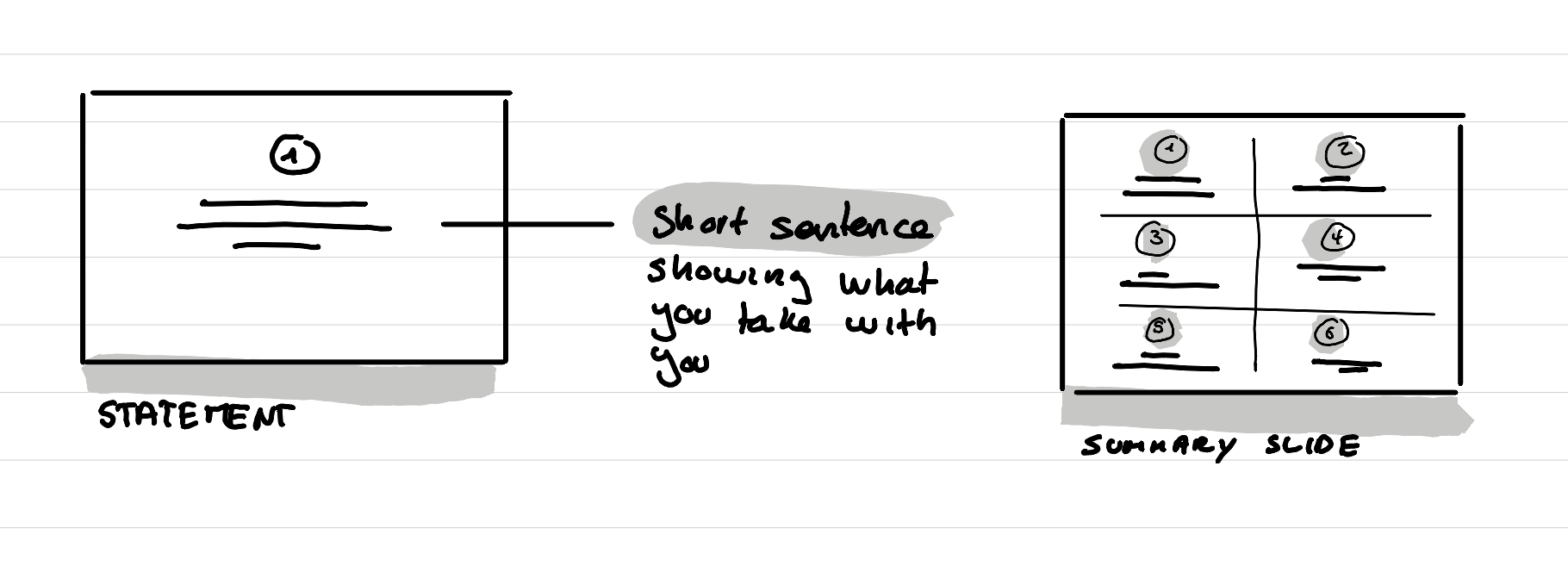
A break slide, that comes again and again, and that makes clear what is the main point, the main thing you take with you. The nice thing when you do this, is that at the end of your presentation you can simply take these statements and show them again all in one slide as a strong summary of your findings. It also creates a ryhtm that is very reassuring like the "so what call out".
Proof points
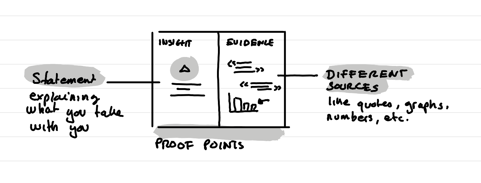
A simple slide where you separate the screen in two parts, the learning you are taking for your project on one side, and the proofs that support this point of view on the other side. This is a great way to show that your data is triangulated through different sources or different methods.
Metaphor
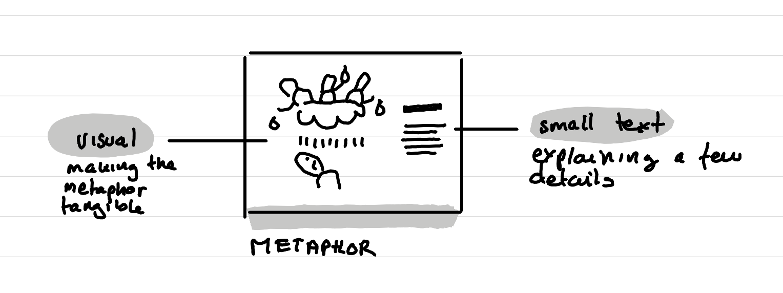
A very visual slide that creates a story, an analogy, a translation of what you've learned. I love to do this with simple sketches that show how a situation feels, or that compare reality versus expectations. Two examples from my practices:
- A metaphor I often used when working on a church strategy was the idea that "This is not the Mcdonalds of churches", which explains that every location has it's own twist and that it's a good thing.
- A drawing I made that shows in the sky behind a big cloud workers of an HQ. Each providing a little drop of water symbolizing help. And then how it feels to get a tsunami on your face when you are working in the field and you get thousand unsynchronised helps at the same time.
There is more
Obviously there are many other ways to do it, these are just a few ones that I've seen again and again, and that have convinced me strongly.
This article was written on a refurbished Remarkable II tablet with a type folio cover. The illustration was made drawn by hand on the same tablet.
Related articles

How to format Microsoft Lists for a course schedule so that it doesn't suck?
In short: with custom JSON code, that you can ask an LLM to help you write, you can adapt how the details of a session in your course look like.
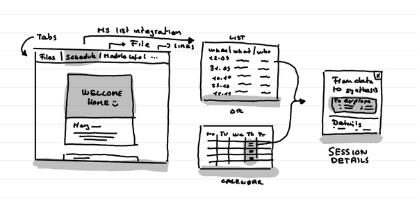
How to create a small course hub in a teams channel
In short: Use tabs to link to key documents, and resources. Use Microsoft List as an integration to put the schedule that shows as a list or a calendar.
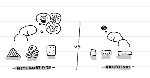
Why I go for alternatives instead of variations when making and testing protoypes
In short: alternatives that are opposing make you learn more than small tweaks.