My two cents
In my work, where the data is usually pretty simple, I tend to stick to some of the easiest charts to read:
- Pie charts
- Bar charts
I personally find that these work extremely well when it comes to comparing different elements.
What the experts say
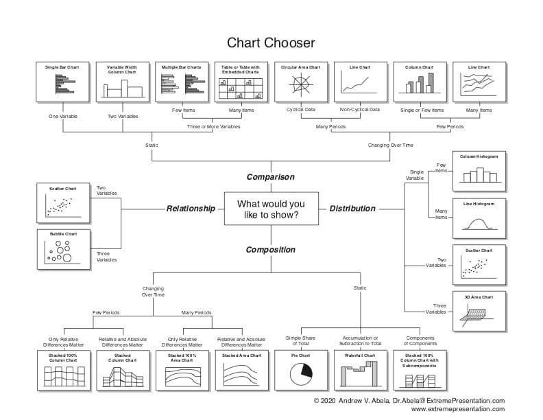
Dr. Abela's Chart Chooser
Dr. Abela has created a system to help you know which type of chart you should use to present your data. He calls it the "Chart Chooser"
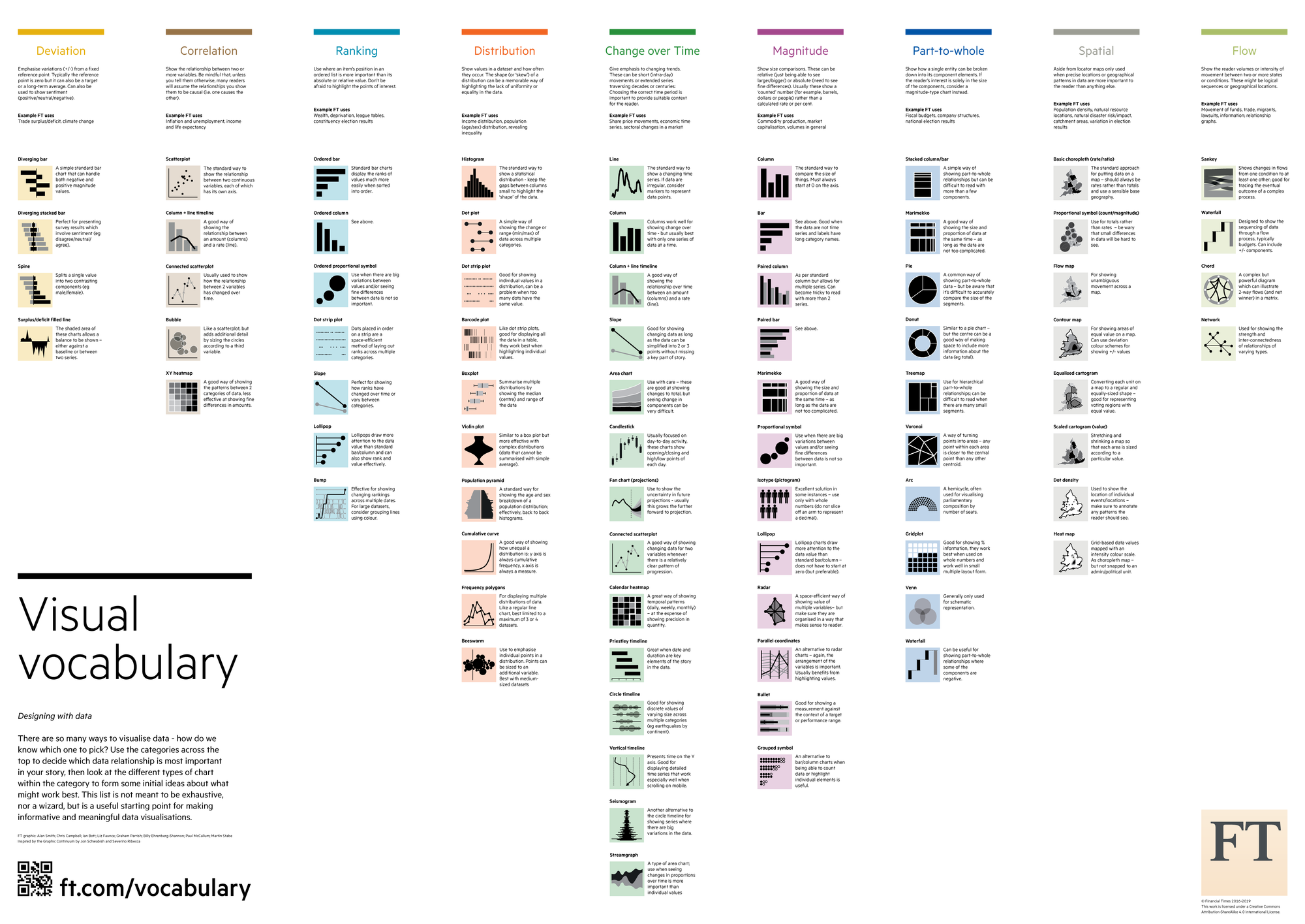
Financial Times Visual Vocabulary
The team at the Financial Times has created a visual vocabulary that also helps you choose the right visualisation. This one gives you 9 categories (like Part-to-whole, Magnitude, Change over Time, Ranking, etc.). And for each category corresponding ways to visualise that.
Going further
Vitaly Friedman, the Founder/Editor-in-chief of Smashing Magazine, has written a good Linkedin post with many other links to such resources that help you choose the right type of visualisation.